Updated · By Peter Kovalsky
How to Make Google Slides Look Good: 12 Fixes That Work
Most Google Slides decks don’t look bad because of the theme. They look bad because every slide was formatted by hand: a different font here, a colour picked from the wheel there, a text box nudged until it “looked about right”. The fastest way to make Google Slides look good is to do the opposite. Pick one theme, set its colors and fonts once in the theme builder, build every slide from a layout, line things up with the guides, and move the words you were going to read aloud into your speaker notes.
This guide walks through those fixes in order, starting with the ones that change the whole deck at once. Steps follow Google’s help on themes, backgrounds and layouts and what we saw in Google Slides on a computer on 25 October 2026, using a test deck built from a Slidesgo template. Our test account showed British spelling (Colours, Centre on page); on a US account the same items read Colors and Center on page. Google renames menu items now and then, so the wording on your screen may differ slightly.
Start with the fixes that change every slide
Order matters. If you restyle slides one at a time and then change the theme, you’ll do the work twice. Work from the top down:
| Order | Fix | Where | Changes |
|---|---|---|---|
| 1 | Choose one theme | Slide → Change theme | Every slide |
| 2 | Set theme colors | Slide → Edit theme → Colors | Every slide that uses theme colors |
| 3 | Set fonts and sizes on the theme | Slide → Edit theme, theme slide | Every layout that inherits them |
| 4 | Use layouts, not loose text boxes | Slide → Apply layout or the Layout button | One slide, or a selection |
| 5 | Align and space objects | Arrange → Align, Distribute, View → Guides | Selected objects |
| 6 | Cut words, move them to notes | The slide and the notes box below it | One slide |
The rest of this guide covers each one, then the smaller habits that make the difference between a tidy deck and a polished one.
1. Pick one theme, and stick with it
A theme is the set of colors, fonts, backgrounds and layouts behind your slides. Changing it restyles every slide that was built from its layouts.
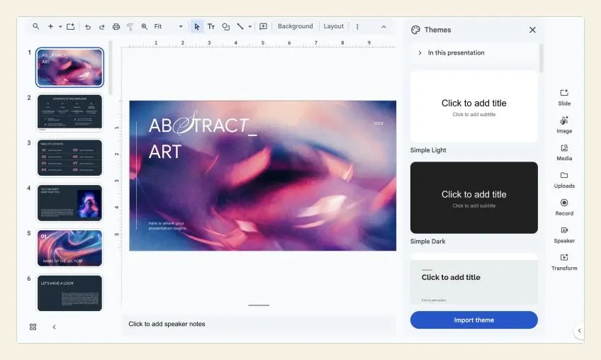
- Open the presentation and choose Slide → Change theme. A Themes panel opens on the right.
- The panel starts with In this presentation, then lists Google’s built-in themes. On our account there were 23: Simple Light, Simple Dark, Streamline, Focus, Shift, Momentum, Paradigm, Material, Swiss, Beach Day, Slate, Coral, Spearmint, Plum, Paperback, Modern Writer, Geometric, Pop, Luxe, Blue & gold, Tropic, Marina and Matchday.
- Click a theme to apply it. Undo (⌘+Z on a Mac, Ctrl+Z on Windows) if you don’t like it.
- To use a theme from another deck, including a PowerPoint file or a template you’ve downloaded, click Import theme at the bottom of the panel, choose the file, pick its theme and click Import theme again.
What to choose. For most talks, a plain theme with a strong title font beats a busy one. Simple Light and Simple Dark are deliberately bare, which makes them a good base for your own colors. If your organization has a branded deck, import its theme instead of copying its look by hand. If you want a ready-made design, the template sites that publish Google Slides files (Slidesgo, for example, which our test deck came from) give you a full theme with matching layouts; import it once rather than pasting their slides into your deck one by one.
Light or dark? A light background is safer in a bright room or on a weak projector, where dark backgrounds turn muddy grey. Dark themes look sharp on a TV or a laptop screen in a dim room. If you don’t know the room, go light.
2. Set your colors once in the theme
Picking colors slide by slide is the main reason decks look inconsistent. Google Slides stores a palette in the theme instead: four Text and background colors, six Accent colors and a Link color. When you then pick a color from the theme section of any color menu, it follows the theme, so changing the theme color later changes it everywhere.
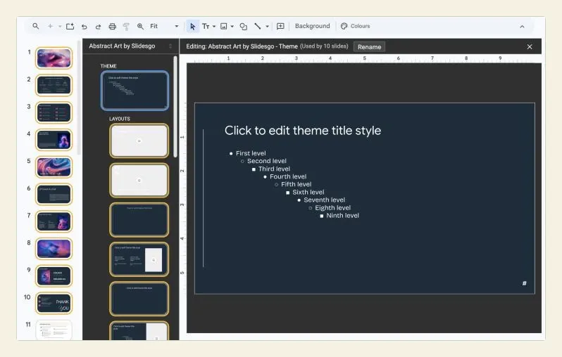
- Choose Slide → Edit theme. The theme builder opens: on the left, the theme slide at the top and its layouts beneath it.
- Click Colors in the toolbar (it shows when the theme builder is open). A Theme colors panel opens on the right.
- Open Choose a theme color and pick the one to change: Text and background 1–4, Accent 1–6 or Link.
- Choose a preset, or enter a hex code for your brand color. Repeat for the others.
- Close the theme builder with the × at the top right of the editing area.
A simple rule that works: one dark color for text, one light color for backgrounds, one accent for emphasis, and a second accent at most. If you need six different accent colors on one slide, the slide is doing too much.
Check the contrast. Text has to stand out from what’s behind it, especially on a projector that washes colors out. The W3C’s accessibility guidelines ask for a contrast ratio of at least 4.5:1 for normal text and 3:1 for large text. Pale grey text on white, and red on dark blue, are the usual failures. Any online contrast checker will tell you the ratio from two hex codes.
3. Set fonts on the theme, not on each slide
The theme builder is also where fonts belong.
- Choose Slide → Edit theme (or View → Theme builder).
- Click the theme slide at the very top of the list. The bar above it reads Editing: [theme name] - Theme, with the number of slides that use it; ours said Used by 10 slides.
- Click into Click to edit theme title style and choose a font and size for titles. Then click into the bullet levels and set the body font.
- Click individual layouts below the theme slide to adjust anything that should differ, such as a larger title on Section header.
- Close the theme builder.
Text you formatted by hand on a slide keeps its own formatting, so it won’t follow the theme. To bring a stray text box back in line, select the text and use Format → Clear formatting (⌘+\ on a Mac, Ctrl+\ on Windows), or rebuild the slide from a layout.
Which fonts. Two at most: one for titles, one for body text, or one family for both. The font list includes More fonts, which opens Google Fonts inside Slides. A clean sans-serif for body text (the test deck used Google Sans) reads well from the back of a room. Script and novelty fonts belong in a title at most, never in bullet points.
How big. Body text that’s comfortable on your laptop is often too small on a projector. A practical floor for a room is around 24 pt for body text, with titles larger; if you can’t fit what you need at that size, the slide has too much on it.
4. Build slides from layouts
A layout is a slide pattern from the theme: where the title goes, where the body goes, where an image sits. Slides built from layouts line up with each other automatically, and they follow the theme when you change it. Loose text boxes don’t.
To change a slide’s layout, select it and click Layout in the toolbar, or choose Slide → Apply layout. The standard set we saw was Title slide, Section header, Title and body, Title and two columns, Title only, One-column text, Main point, Section title and description, Caption, Big number and Blank. Imported themes often add their own; our template added layouts such as Numbers and text and Table of contents.
When you add a slide, use the arrow next to the + (new slide) button to choose its layout up front. Two layouts are underused:
- Main point puts one big sentence on the slide. Use it for the line you want the room to remember.
- Big number is made for a single statistic. One number, large, with a short label, is more striking than the same number buried in a bullet list.
5. Line things up
Nothing makes a slide look amateur faster than objects that are almost, but not quite, aligned.
- Align. Select two or more objects (hold Shift and click each), then choose Arrange → Align and pick left, center, right, top, middle or bottom.
- Distribute. With three or more objects selected, Arrange → Distribute → Horizontally or Vertically makes the gaps between them equal.
- Center on page. Arrange → Center on page puts a single object in the middle of the slide, horizontally or vertically.
- Snap to guides. Under View → Snap to, our account had Guides ticked and Grid available. With snapping on, objects catch on the guides as you drag, which makes it easier to line things up by hand.
- Custom guides. View → Guides lets you add your own guide lines, so the same margin holds on every slide.
- Group. Once a picture and its caption line up, select both and choose Arrange → Group so they move together.
Leave a margin. Text and pictures jammed against the edge of the slide look cramped, and some projectors and TVs cut off the edges slightly. Keep the same margin on every slide; the layouts already do this if you let them.
6. Say less on the slide
The single biggest improvement to most decks isn’t visual at all: it’s taking words off the slides. A slide is something the audience glances at while listening to you. If they’re reading paragraphs, they aren’t listening.
- One idea per slide. If a slide has two points, make it two slides. Slides cost nothing.
- Short phrases, not sentences. “Response time down 40%” instead of “We were able to reduce our average response time by forty percent over the quarter.”
- No more than a handful of bullets. If you need more, the slide is probably a document. Share the document separately.
- Put the full sentences in your speaker notes. Everything you meant to say goes in the box under the slide, where only you see it. Our guide to adding speaker notes in Google Slides covers how, and what to write in them.
This is where the look of the deck and the way you present it meet. People cram text onto slides because they’re afraid of forgetting what to say. Once your notes are somewhere you can see them, the slides can be clean. In a room with a second screen, Presenter view shows your notes on the laptop while the audience sees the slides. If you’re presenting from one screen, or want to walk away from the laptop, Copresent puts your speaker notes on your phone and lets you move the slides from it. The host installs the Copresent Chrome extension on the presenting computer and signs in with Google; there’s no app to install on the phone.
7. Use fewer, bigger pictures
One good photo that fills the slide beats four small ones arranged in a grid.
- Insert → Image offers Upload from computer, Stock and web, Drive and Photos, Camera and By URL, plus Generate an image on accounts that have it. Check the image’s licence before using anything from the web.
- Fill the slide or don’t. A picture that bleeds off all four edges looks deliberate. A picture floating with a thin, uneven border looks accidental.
- Crop rather than squash. Resize a photo from a corner handle, and use the crop button in the small toolbar that appears when the image is selected. Dragging a side handle stretches the picture, which is most obvious on faces.
- Text on a photo needs help. Put the text where the photo is plain, or put a semi-transparent shape behind it. Check the contrast again.
- Use the same style throughout. All photos, or all flat icons, not a mix of clip art, screenshots and stock photos.
8. Change the background for the whole deck, not one slide
To change the background, choose Slide → Change background. Pick a color or an image, then click Add to theme to apply it to every slide that uses the theme, or Done for just the selected slide. Google’s help says background images must be GIF, JPG or PNG files under 50 MB.
Busy background photos are the second most common reason text is hard to read, after small fonts. If you want a photo behind every slide, choose one that is mostly empty and slightly blurred, or use it only on the title and section slides.
9. Use transitions and animations sparingly
Motion is the fastest way to make a good-looking deck feel cheap. Pick one simple transition, such as Fade or Dissolve, apply it to all slides, and leave it there. Use object animations only when the order of appearance helps the explanation, such as revealing the answer after the question. Our guides to Google Slides transitions and animations cover both in detail.
10. Make charts and tables readable from the back
- Charts. Delete what you don’t need: gridlines, a legend for a single series, extra decimal places. Use your accent color for the one bar or line you’re talking about and grey for the rest.
- Tables. Fewer rows and columns than you think. A table with 40 cells is unreadable on a projector. Show the three numbers that matter, and put the full table in a handout.
- Label directly. Put labels on the chart instead of in a legend, so nobody has to match colors.
11. Small habits that keep a deck consistent
These are the “hacks” that experienced Slides users rely on:
- Paint format. Select formatted text or a shape, click the paint-roller icon (Paint format) in the toolbar, then click the object you want to copy the formatting to.
- Grid view. View → Grid view shows every slide at once. Inconsistent titles, odd colors and crowded slides stand out immediately.
- Duplicate, don’t rebuild. When a slide works, use Slide → Duplicate slide and change the content, so spacing and sizes stay identical.
- Skip, don’t delete. Slide → Skip slide hides a backup slide in the slideshow without throwing it away.
- Learn a few shortcuts. Our list of Google Slides keyboard shortcuts covers the ones worth knowing for presenting.
Some accounts also show Gemini options such as Beautify this slide or Beautify as image in the Slide menu. They can suggest a design for a slide, but the result still has to fit the rest of your deck; check it against your theme colors and fonts before keeping it.
12. Check it the way the audience will see it
The editor isn’t what the audience sees. Before you present:
- Start the slideshow (Slideshow, or ⌘+Enter on a Mac / Ctrl+Enter on Windows) and go through every slide full screen.
- Stand back from the screen, or shrink the browser window to the size of a phone, and check whether the smallest text is still readable.
- If you can, try it on the projector or TV you’ll use. Colors that look fine on a laptop can disappear on a projector.
Example: tidying a 10-slide project update
Hypothetically, a team lead has a 10-slide update. Five people added slides, so it has three fonts, four shades of blue and bullet lists on every slide.
- They choose Slide → Change theme → Simple Light, so every slide built from a layout picks up the same backgrounds and fonts.
- In Slide → Edit theme → Colors, they set Accent 1 to the company blue and Text and background 1 to a dark grey.
- On the theme slide, they set the title font to a bold sans-serif and the body to the same family at a size that’s readable from the back of the meeting room.
- They select each hand-formatted text box, use Format → Clear formatting, and switch three crowded slides to Title and two columns.
- The slide with eight bullets becomes two slides, and the sentences they were going to read move into the speaker notes.
- View → Grid view shows one slide still has a stray red title. They fix it with Paint format.
Nothing new was designed. The deck simply stopped disagreeing with itself.
If it still doesn’t look right
| Problem | Likely cause | Fix |
|---|---|---|
| A slide ignores the new theme | It was built from loose text boxes or formatted by hand | Apply a layout, then Format → Clear formatting on stray text |
| Colors change between slides | Colors were picked from the color wheel, not the theme | Re-pick them from the theme colors, or set them in Edit theme → Colors |
| A font change only affected one slide | It was changed on the slide, not the theme | Change it on the theme slide in the theme builder |
| Text is hard to read on the projector | Low contrast or small text | Darker text, plainer background, larger size |
| Imported slides look different | They brought their own theme with them | Apply your layouts to them, or import their theme deliberately |
| Objects look slightly off | They were dragged by eye | Select them and use Arrange → Align and Distribute |
| The slide feels crowded | Too many ideas on one slide | Split it, and move sentences into the speaker notes |
Checklist before you share or present
- One theme, applied to every slide.
- Theme colors set once; no colors picked by hand off the color wheel.
- Two fonts at most, set on the theme slide.
- Every slide built from a layout, with the same margins.
- Objects aligned with Arrange → Align and Distribute.
- One idea per slide; full sentences in the speaker notes.
- Pictures large, not stretched, in one consistent style.
- One simple transition, or none.
- Checked in the slideshow, full screen, from a distance.